 by
by
In this Python, scientific computing, SciPy, probability and statistics tutorial, we explain how to
- Generate a normal distribution with the prescribed mean and standard deviation in Python.
- Compute normal distribution percentiles.
- Compute values of a probability density function of a normal distribution.
- Plot the graph of a probability density function of a normal distribution.
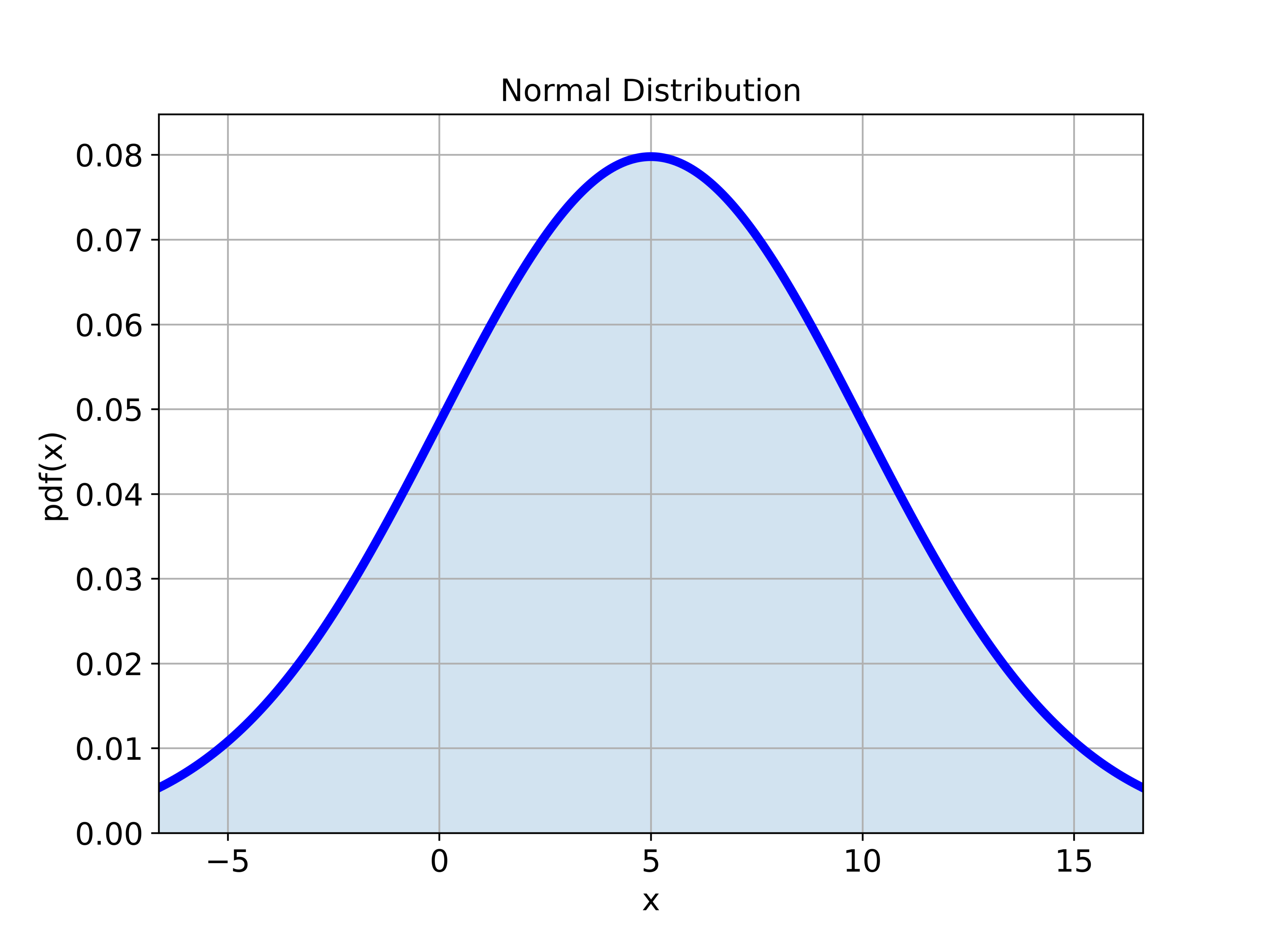
We generate the normal distribution by using the SciPy Python library. More precisely, we use a statistical function module called “stats” from the SciPy library. By the end of this tutorial, among a number of useful statistical computing techniques, you will learn how to generate a graph of the normal distribution shown below.
The YouTube tutorial accompanying this webpage is given below.
Normal Distribution in Python
The general form of the probability density function of the normal distribution is
(1) 
where
 is the mean of the distribution.
 is the standard deviation.
 is the variance.
 is the independent variable
We define the normal distribution by using the Python script given below.
import numpy as np
from scipy import stats
import matplotlib.pyplot as plt
import seaborn as sns


# define a normal distribution in Python:

# mean value
meanValue=5

# standard deviation
standardDeviation=5

# create a normal distribution
# the keyword "loc" is used to specify the mean
# the keyword "scale" is used to specify the standard deviation
distribution=stats.norm(loc=meanValue, scale=standardDeviation)

# calculate the moments
meanComputed, varComputed, skewComputed, kurtComputed = distribution.stats(moments='mvsk')
First, we import the necessary libararies. We import the NumPy library and from SciPy library, we import the statistical function module called “stats”. We also import the plotting function and the Seaborn library for data visualization. We define the mean value and the standard deviation. To define the normal distribution, we use the function “stats.norm()”. The first input of this function is the mean and the second input is the standard deviation. This function returns an object defining the distribution. We can calculate the first four moments of the distribution by using the function “stats(moments=’mvsk’)”.
Next, we explain how to compute the percentiles. The Python script given below will compute 5-th, 50-th, and 90-th perecentiles.
# ppf - percent point function (it is the inverse of cdf — percentiles)
# accepts the percentage as an input
# this is, calculate the percentile
# ppf stands for "Percent Point Function"

# returns the mean
distribution.ppf(0.5)

# 5 and 95 percentiles
distribution.ppf(0.05)

distribution.ppf(0.95)

# double check, this expression should be equal to the mean
(distribution.ppf(0.95)+distribution.ppf(0.05))/2
To compute the percentiles, we use the function “ppf()”. The input of this function is the percentile, and the output is the value. We also verify the computations by verifying the mean of two percentile values.
The Python script shown below will compute the values of the probability density function.
# plot the distribution
# start point
startPointXaxis=distribution.ppf(0.01)
# end point
endPointXaxis=distribution.ppf(0.99)

# create the x values
xValue = np.linspace(startPointXaxis,endPointXaxis, 500)

# the function pdf() will return the probability density function values
yValue = distribution.pdf(xValue)
To compute the probability density function values, we use the function “pdf()”. The input of this function is the NumPy array “xValue” defining the values for which the probability density function is computed. The output of this function is the NumPy array of computed values of the probability density function.
We plot the probability density function by using the Python script given below.
# plot the probability density function
plt.figure(figsize=(8,6))
plt.gca()
plt.plot(xValue,yValue, color='blue',linewidth=4)
plt.fill_between(xValue, yValue, alpha=0.2)
plt.title('Normal Distribution', fontsize=14)
plt.xlabel('x', fontsize=14)
plt.ylabel('pdf(x)',fontsize=14)
plt.tick_params(axis='both',which='major',labelsize=14)
plt.grid(visible=True)
plt.xlim((startPointXaxis,endPointXaxis))
plt.ylim((0,max(yValue)+0.005))
plt.savefig('normalDistribution.png',dpi=600)
plt.show()
The figure is shown below.