by
by In this Python, probability, and statistic tutorial, we explain
- How to create a normal distribution in Python
- How to plot a normal distribution in Python
- How to generate or draw random samples from a normal distribution in Python
- How to generate a histogram graph of random samples in Python
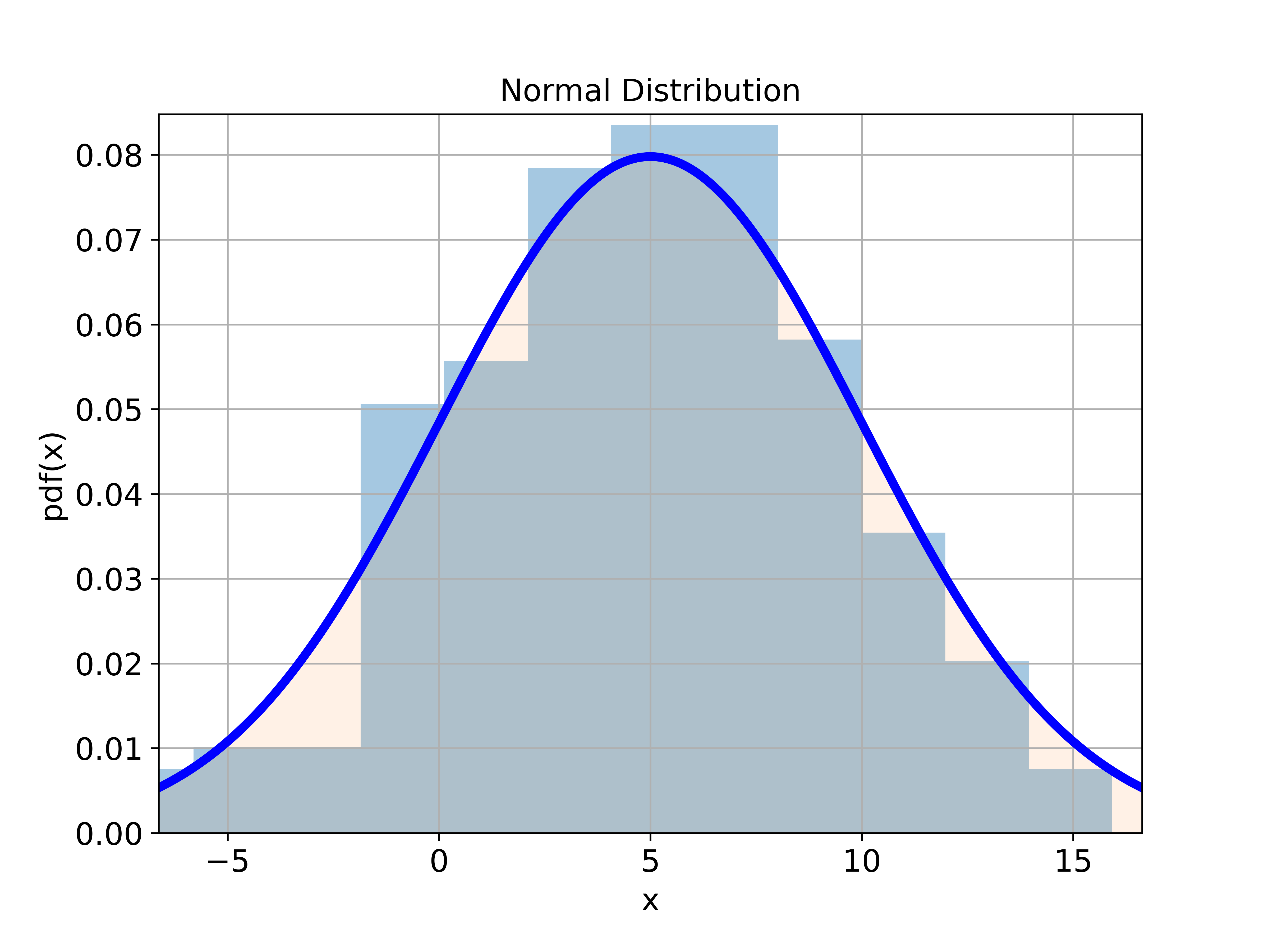
This statistics tutorial is based on the SciPy Python library. In particular, we use the module called “stats” from SciPy to generate a normal distribution. By reading this statistics and Python tutorial, you will learn how to generate the histogram plot shown below that represents the histogram of random samples generated from the normal distribution.

The YouTube tutorial accompanying this post is given below.
Create Normal Distribution, Probability Density Function, and Plot
First, we explain how to create a normal distribution in Python and how to generate a Python plot of the probability density function of the normal distribution. The following Python script creates a normal distribution.
import numpy as np
from scipy import stats
import matplotlib.pyplot as plt


# define a normal distribution in Python:

# mean value
meanValue=5

# standard deviation
standardDeviation=5

# create a normal distribution
# the keyword "loc" is used to specify the mean
# the keyword "scale" is used to specify the standard deviation
distribution=stats.norm(loc=meanValue, scale=standardDeviation)
First, we import the necessary libraries, functions, and modules: NumPy, stats, and matplotlib.pyplot. Then, we define the mean and standard deviation of the normal distribution. Finally, we create the normal distribution by using stats.norm() function. The first input of this function is the mean value and the second input of this function is the standard deviation of the distribution. The function “stats.norm()” returns the object representing the normal distribution. This object has several methods that can be used to perform various tasks, such as generating percentiles and generating samples.
The Python script shown below will evaluate the probability density function of the normal distribution at the prescribed points, and will plot the probability density function.
# plot the probability density function of the distribution
# start point
startPointXaxis=distribution.ppf(0.01)
# end point
endPointXaxis=distribution.ppf(0.99)

# create the x values
xValue = np.linspace(startPointXaxis,endPointXaxis, 500)

# the function pdf() will return the probability density function values
yValue = distribution.pdf(xValue)


# plot the probability density function
plt.figure(figsize=(8,6))
plt.gca()
plt.plot(xValue,yValue, color='blue',linewidth=4)
plt.fill_between(xValue, yValue, alpha=0.2)
plt.title('Normal Distribution', fontsize=14)
plt.xlabel('x', fontsize=14)
plt.ylabel('pdf(x)',fontsize=14)
plt.tick_params(axis='both',which='major',labelsize=14)
plt.grid(visible=True)
plt.xlim((startPointXaxis,endPointXaxis))
plt.ylim((0,max(yValue)+0.005))
plt.savefig('normalDistribution2.png',dpi=600)
plt.show()
The generate the plot of the probability density function, we first need to specify the range of values on the x axis. For that purpose, we use the function “ppf()”. The name of this function is an abbreviation of “Percent Point Function”. For a given input that represents the percentage, it returns the corresponding percentile value (also known as score in statistics terminology). Since we want to plot the largest part of the distribution, we specify 0.01 and 0.99 to obtain the corresponding percentile value on the horizontal axis. Then, by using such computed value, we create the NumPy array of “x” axis values called “xValue “. Then, by using “xValue” as an input, we call the function “pdf()” that generates the NumPy Array called “yValue ” representing the probability density values at the input points in the NumPy array “xValue”. Finally, we plot the distribution.
Generation of Random Samples from Normal Distribution in Python and Histogram Plot of Generated Samples
To generate random samples from the normal distribution in Python, we use the following script
# generate random samples from the normal distribution
sampleSize=200
randomSamples = distribution.rvs(size=sampleSize)
The name of the function for generating random samples from a normal distribution is “rvs()”.
The Python script given below plots the histogram of the generated random samples and on the same graph also plots the ideal probability density function
plt.figure(figsize=(8,6))
plt.hist(randomSamples, density=True, bins='auto',
            histtype='stepfilled',
            alpha=0.4)
plt.plot(xValue,yValue, color='blue',linewidth=4)
plt.fill_between(xValue, yValue, alpha=0.1)
plt.title('Normal Distribution', fontsize=14)
plt.xlabel('x', fontsize=14)
plt.ylabel('pdf(x)',fontsize=14)
plt.tick_params(axis='both',which='major',labelsize=14)
plt.grid(visible=True)
plt.xlim((startPointXaxis,endPointXaxis))
plt.ylim((0,max(yValue)+0.005))
plt.savefig('normalDistributionHistogram.png',dpi=600)
plt.show()
To generate the histogram of the random samples, we use the function pyplot.hist(). The histogram plot is given in the figure below.