 by
by In this post, we explain how to visualize classes by using scatter plots. These plots are important for visualizing data sets in classification problems in Python and Scikit-learn library. The YouTube video accompanying this post is given below:
To make a long story short, we explain how to generate the plot shown in the figure below.
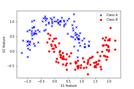
This graph represents the 2D plot of the features of the two classes in the Moons data set from the scikit-learn library.
First, we import the necessary libraries.
from sklearn.datasets import make_moons
import matplotlib.pyplot as plt
import numpy as np
The scikit-learn library contains many data sets, and one of these sets is make_moons. Next, we generate the training data:
X, y = make_moons(n_samples=200, noise = 0.15)
The X matrix, with 200 rows (number of samples) and 2 columns (number of features), represents the data. The vector y, represents the target data set, denoting the classes. For example, if the i-th entry of the vector y is 1, then the i-th row of the matrix X belongs to class 1. Similarly, if the j-th entry of the vector y is 0, then the j-th row of the matrix X belongs to class 0. Our task is to visualize these entries and to properly denote their class membership.
For that purpose, we will use the function np.where(). This function is best illustrated through the following example:
tmp1=np.array([1,-1,0,10,-2])
index_positive_number=np.where(tmp1>0)
index_negative_number=np.where(tmp1<0)
The code line np.where(tmp1>0) returns the indices of the entries of the vector tmp1 that are larger than 0. Similiary, the code line np.where(tmp1<0) returns the indices of the vector tmp1 that correspond to entries that are smaller than 0. By using this trick, we can separate the X and y data according to their class membership.
ClassAIndices=np.where(y==0)
ClassAIndices=ClassAIndices[0].tolist()
ClassBIndices=np.where(y==1)
ClassBIndices=ClassBIndices[0].tolist()

XclassA=X[ClassAIndices,:]
XclassB=X[ClassBIndices,:]
yclassA=y[ClassAIndices]
yclassB=y[ClassBIndices]
The next step is to plot these two classes by using the scatter plot in Python
plt.scatter(XclassA[:,0],XclassA[:,1], color='blue', marker='x', label='Class A')
plt.scatter(XclassB[:,0],XclassB[:,1], color='red', marker='o', label='Class B')
plt.xlabel('X1 feature')
plt.ylabel('X2 feature')
plt.legend()
plt.savefig('finalFigure.png')
plt.show()
These lines of code generate the figure ‘finalFigure.png’ that is shown below.
