 by
by In this post, we explain how to solve classification problems in Python’s scikit-learn library. We also explain how to visualize the results, which is a very important step. The YouTube video accompanying this post is given below.
The GitHub page with all the codes is given here.
To demonstrate how to solve the classification problems, we will use the famous Iris Dataset. Loosely speaking, the problem is to classify three iris species, on the basis of the geometrical features of the flowers (length and width of sepal and petal). The characteristic feature of this data set is that one flower species is linearly separable from the other two. However, the other two are not linearly separable from each other. That is, one class is separable from the other two, and two classes are not separable from each other. After mastering this tutorial, you will be able to visualize the classification results by generating the graph shown below. The left panel of this graph shows the classification areas and training samples. The right panel of this graph shows the classification areas and training samples.

The figure below shows the steps that we will perform:
First, we import the necessary libraries and functions
# we import data sets
from sklearn import datasets
import numpy as np
from sklearn.model_selection import train_test_split
from sklearn.preprocessing import StandardScaler
from sklearn.linear_model import Perceptron
The function “train_test_split()” will be used to split the data set into training and test data sets. This is necessary in order to properly test the trained model performance (this will be explained later in the text). Then, “StandardScaler()” function is used to center and scale the data by subtracting the mean from the data and by dividing the result by the standard deviation. This is necessary since most of the classifiers are designed to worked with centered and scaled data. We will use “Perceptron()” classifier. This is arguably one of the most simple classifiers. We use it for illustration purposes. Everything that is explained in this post generalizes to other types of classifiers.
Next, we define the visualization function that is used to generate the plots shown in Fig. 1.
# define the visualization function
def visualizeClassificationAreas(usedClassifier,XtrainSet, ytrainSet,XtestSet, ytestSet, plotDensity=0.01 ):
    '''
    This function visualizes the classification regions on the basis of the provided data

    usedClassifier      - used classifier

    XtrainSet,ytrainSet - train sets of features and target classes
                    - the region colors correspond to to the class numbers in ytrainSet

    XtestSet,ytestSet   - test sets for visualizng the performance on test data that is not used for training
                    - this is optional argument provided if the test data is available

    plotDensity         - density of the area plot, smaller values are making denser and more precise plots

    IMPORTANT COMMENT:  -If the number of classes is larger than the number of elements in the list
                    caller "colorList", you need to increase the number of colors in
                    "colorList"
                    - The same comment applies to "markerClass" list defined below

    '''
    import numpy as np
    import matplotlib.pyplot as plt
    # this function is used to create a "cmap" color object that is used to distinguish different classes
    from matplotlib.colors import ListedColormap

    # this list is used to distinguish different classification regions
    # every color corresponds to a certain class number
    colorList=["blue", "green", "orange", "magenta", "purple", "red"]
    # this list of markers is used to distingush between different classe
    # every symbol corresponds to a certain class number
    markerClass=['x','o','v','#','*','>']

    # get the number of different classes
    classesNumbers=np.unique(ytrainSet)
    numberOfDifferentClasses=classesNumbers.size

    # create a cmap object for plotting the decision areas
    cmapObject=ListedColormap(colorList, N=numberOfDifferentClasses)

    # get the limit values for the total plot
    x1featureMin=min(XtrainSet[:,0].min(),XtestSet[:,0].min())-0.5
    x1featureMax=max(XtrainSet[:,0].max(),XtestSet[:,0].max())+0.5
    x2featureMin=min(XtrainSet[:,1].min(),XtestSet[:,1].min())-0.5
    x2featureMax=max(XtrainSet[:,1].max(),XtestSet[:,1].max())+0.5

    # create the meshgrid data for the classifier
    x1meshGrid,x2meshGrid = np.meshgrid(np.arange(x1featureMin,x1featureMax,plotDensity),np.arange(x2featureMin,x2featureMax,plotDensity))

    # basically, we will determine the regions by creating artificial train data
    # and we will call the classifier to determine the classes
    XregionClassifier = np.array([x1meshGrid.ravel(),x2meshGrid.ravel()]).T
    # call the classifier predict to get the classes
    predictedClassesRegion=usedClassifier.predict(XregionClassifier)
    # the previous code lines return the vector and we need the matrix to be able to plot
    predictedClassesRegion=predictedClassesRegion.reshape(x1meshGrid.shape)
    # here we plot the decision areas
    # there are two subplots - the left plot will plot the decision areas and training samples
    # the right plot will plot the decision areas and test samples
    fig, ax = plt.subplots(1,2,figsize=(15,8))
    ax[0].contourf(x1meshGrid,x2meshGrid,predictedClassesRegion,alpha=0.3,cmap=cmapObject)
    ax[1].contourf(x1meshGrid,x2meshGrid,predictedClassesRegion,alpha=0.3,cmap=cmapObject)

    # scatter plot of features belonging to the data set
    for index1 in np.arange(numberOfDifferentClasses):
        ax[0].scatter(XtrainSet[ytrainSet==classesNumbers[index1],0],XtrainSet[ytrainSet==classesNumbers[index1],1],
                   alpha=1, c=colorList[index1], marker=markerClass[index1],
                   label="Class {}".format(classesNumbers[index1]), edgecolor='black', s=80)

        ax[1].scatter(XtestSet[ytestSet==classesNumbers[index1],0],XtestSet[ytestSet==classesNumbers[index1],1],
                   alpha=1, c=colorList[index1], marker=markerClass[index1],
                   label="Class {}".format(classesNumbers[index1]), edgecolor='black', s=80)

    ax[0].set_xlabel("Feature X1",fontsize=14)
    ax[0].set_ylabel("Feature X2",fontsize=14)
    ax[0].text(0.05, 0.05, "Decision areas and training samples", transform=ax[0].transAxes, fontsize=14, verticalalignment='bottom')
    ax[0].legend(fontsize=14)

    ax[1].set_xlabel("Feature X1",fontsize=14)
    ax[1].set_ylabel("Feature X2",fontsize=14)
    ax[1].text(0.05, 0.05, "Decision areas and test samples", transform=ax[1].transAxes, fontsize=14, verticalalignment='bottom')
    #ax[1].legend()
    plt.savefig('classification_results.png')
This function will be explained in our next post, which can be found here. For the time being, we will skip the explanation of this function. In order to use this function, you do not need to know how it works internally.
The next step is to load the data set and perform exploration.
# load the data set
irisDataSet =datasets.load_iris()

# explore the data set
# we have 4 features
irisDataSet['feature_names']
# we have 3 targets - 3 classes
irisDataSet['target_names']
# feature data set : number of samples \times number of features
irisDataSet['data']
irisDataSet['target']
Basically, we have four input features that are used for the classification:
[‘sepal length (cm)’,
‘sepal width (cm)’,
‘petal length (cm)’,
‘petal width (cm)’]
Then, we have four target or classes
[‘setosa’, ‘versicolor’, ‘virginica’]
Since we want to be able to visualize the input features, we will reduce the input feature space, by selecting only two columns from the original input feature data set, for our classification:
# extract only two features for classification
Xfeatures=irisDataSet['data'][:,[2,3]]
YtargetClasses=irisDataSet['target']
The matrix “Xfeatures” and the row vector “YtargetClasses” are used for classification. Note that the three different classes are denoted by $\{0,1,2\}$. Next, we split the data set into training and test data sets:
XfeaturesTrain, XfeaturesTest, YtargetClassesTrain, YtargetClassesTest = train_test_split(Xfeatures,
YtargetClasses,test_size=0.2, random_state=1, stratify=YtargetClasses)

# arguments:
# 1. features, 2. targets, 3. test/train size ratio,
# 4.random_state=1 make sure that the results are repeatable every time we run the function
# 5. stratify=y - stratified sampling to make sure that the proportio of samples in train
# and test data sets correspond to the proportion of samples of classes in the original
# YtargetClassesTest data set. That is empirical distributions of classes in train and
# test data sets have to mach the empirical distribution of classes in the original data set
The original data set is split into two subsets (XfeaturesTrain,YtargetClassesTrain) and (XfeaturesTest,YtargetClassesTest). Basically, the main idea is to use the (XfeaturesTrain,YtargetClassesTrain) data tuple for training the classifier. Then, the set (XfeaturesTest,YtargetClassesTest) that is never seen by the classifier during its training, is used for comparison with the predictions of the classifier. This is a very important step in validating the performance of the classifier since, without this step, the performance of the classifier might seem very good when tested on the training data. We can observe that the classifier performs well on the training data, and we might think that our classifier works very well. However, this is not a proper validation measure. We always need to validate the performance of the classifier on the data set that is not used during training. The explanation of the arguments of the function “train_test_split()” are given below the code. Here we will just mentioned that the function train_test_split() shuffles the data and performs stratified sampling in order to ensure that all the classes in the training and testing data sets are represented in the same proportion as in the original data set. We can verify this by typing
# let us test that the stratified sampling is achieved
np.bincount(YtargetClasses)
np.bincount(YtargetClassesTrain)
np.bincount(YtargetClassesTest)
Now, we have to step back from coding and explain what is the exact type of classification that we are performing. Namely, we perform multi-class classification since the target set has more than two classes. The Perceptron() classifier that we will be using performs by default heuristic form of multi-class classification, that is called One-vs-Rest (OvR). This method uses a heuristic approach where the multi-class problem is decomposed into a series of binary classification problems. For example, since we have 3 classes $\{0,1,2\}$, the method automatically performs the following classification:
Binary classifier 1: class 0 is class A, and classes 1,2 are the class B
Binary classifier 2: class 1 is class A, and classes 0,2 are the class B
Binary classifier 3: class 2 is class A, and classes 0,1 are the class B
The classifier that produces the best score for the training class membership is used to predict the class. This approach has some drawbacks, and there are more sophisticated classifiers that we will discuss over here.
Next, we center and scale the data, by calling StandardScaler(). This is a necessary step in order to ensure the proper performance of the classifier.
standardScaler = StandardScaler()
standardScaler.fit(Xfeatures)
# here we transform the data
XfeaturesTrainScaled=standardScaler.transform(XfeaturesTrain)
XfeaturesTestScaled=standardScaler.transform(XfeaturesTest)
Next, we train the initialize, train, and verify the performance of the Perceptron() classifier. The code is given below
# initialize the perceptronClassifier
perceptronClassifier=Perceptron(eta0=0.1,random_state=1)
# eta0=0.1 learning rate
# random_state=1, ensure that the results are reproducible due to initial random shuffling of the data

# learn the model
perceptronClassifier.fit(XfeaturesTrainScaled,YtargetClassesTrain)

# predict the classes
predictedClassesTest=perceptronClassifier.predict(XfeaturesTestScaled)

# check the performance
numberOfMisclassification= (predictedClassesTest!=YtargetClassesTest).sum()

# percentage of misclassification
misclassificationPercentage=(numberOfMisclassification/(YtargetClassesTest.size))*100
This code is self-explanatory, and the arguments of functions are explained below the code. Finally, we plot the results, by using the function “visualizeClassificationAreas()”:
# plot the decision regions
visualizeClassificationAreas(perceptronClassifier,XfeaturesTrainScaled,YtargetClassesTrain,XfeaturesTestScaled,YtargetClassesTest)
The results are given in the figure below.
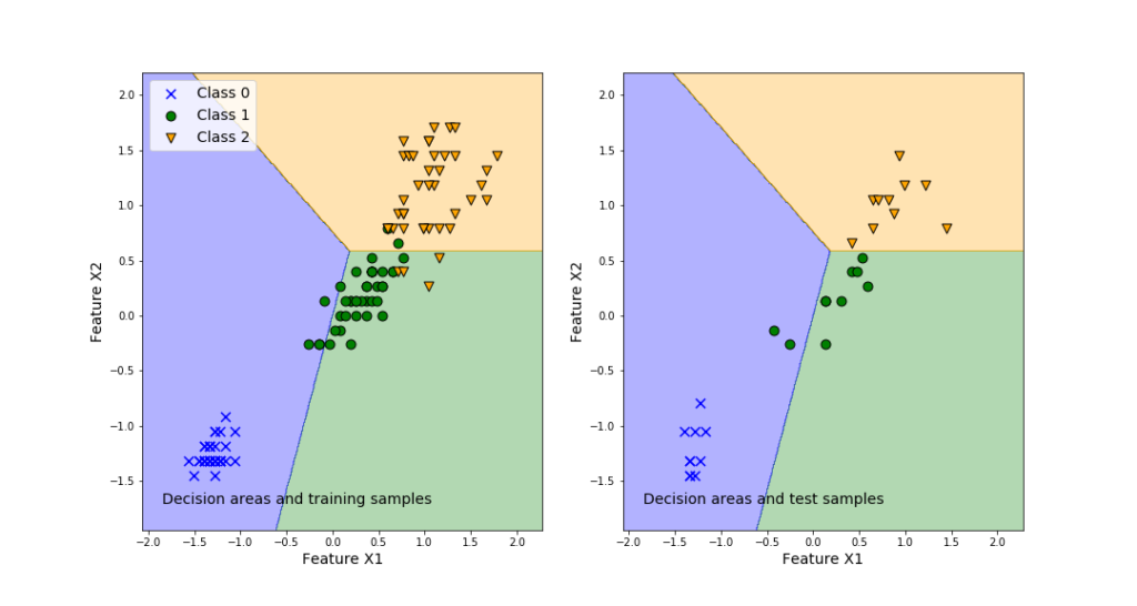
The left plot in the above figure represents the decision regions for the three classes. Also, this graph plots the training samples. We can observe that even in the case of the training samples, some samples are misclassified. This is inevitable since we are using linear separation regions. The right plot shows the prediction performance of the classifier obtained by using the training data set.
This is the end of the post. I hope that you will find this post useful.