by
by In this Python, Matplotlib, and scientific computing tutorial, we explain
- How to generate professional-looking scatter plots in Python.
- How to adjust the scatter plot parameters, such as marker shape, marker size, marker color, marker transparency, etc.
- How to adjust the scatter plot label size and fonts and how to properly format the scatter plot.
- How to save a scatter plot to an image file or a PDF file.
To generate the scatter plot we use the Matplotlib function called pyplot.scatter().
After reading this Python plotting tutorial, you will be able to generate the scatter plots shown below.

The YouTube video tutorial accompanying this webpage tutorial is given below.
How to Generate Scatter Plots in Python
First, let us create two 2D-data sets by using the Python script given below.
import numpy as np
import matplotlib.pyplot as plt

# generate random x and y variables
# we create two clusters
sampleSize=100

x1= 2+np.random.randn(sampleSize)
y1= 3+np.random.randn(sampleSize)

x2=-2+np.random.randn(sampleSize)
y2=-3+np.random.randn(sampleSize)
First, we import the NumPy library and the pyplot function from Matplotlib library which is necessary for generating the plots. Then, we create two 2D random data sets. The first data set is centered around the point (2,3) in the x-y plane, and the second data set is centered around the point (-2,-3). To create these data sets, we use the Numpy function called “np.random.randn()”. This function generates samples from the standard normal distribution.
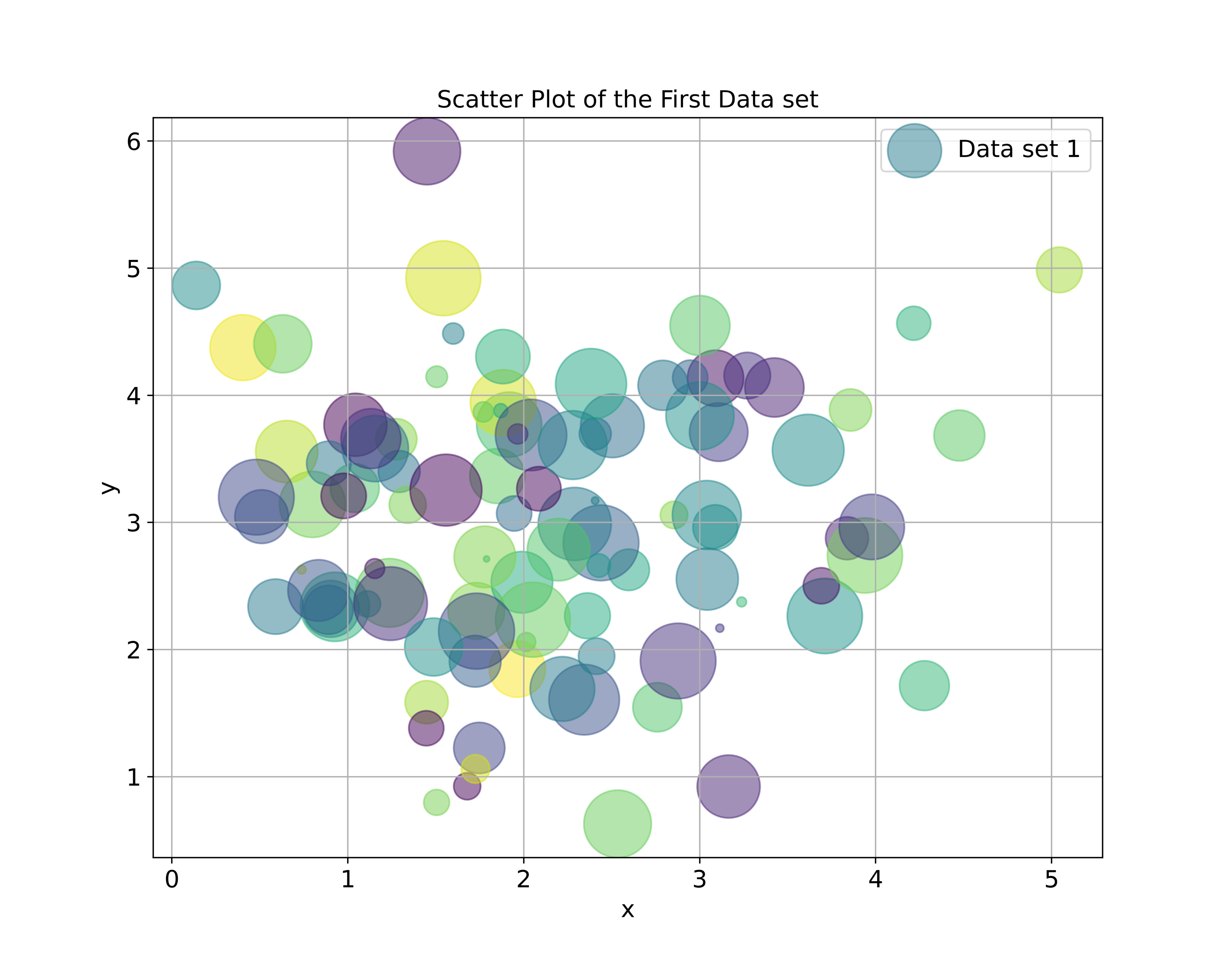
To generate the scatter plots, we use the function pyplot.scatter() or in the imported form plt.scatter(). The first two inputs of this function are the x and y coordinates of the scatter point. The Python script given below explains how to use the scatter() function.
# generate a simple scatter plot
# plot the binomial distribution's pmf
plt.figure(figsize=(8,6))
# s is the marker size
# alpha is the transparency
plt.scatter(x1,y1, marker='x', s=100, label='Data set 1', alpha =0.5)
plt.scatter(x2,y2, marker='o', s=100, label='Data set 2', alpha=0.5)

plt.title('Scatter Plot of Two Data sets', fontsize=14)
plt.xlabel('x', fontsize=14)
plt.ylabel('y',fontsize=14)
plt.tick_params(axis='both',which='major',labelsize=14)
plt.legend(fontsize=14)
plt.grid()
plt.savefig('ScatterPlot1.png', dpi=600)
plt.show()
The used parameters of the scatter() function are
- marker=’x’ or marker=’o’- this parameter sets the marker shape
- s=100 – this parameter is the marker size. It can be a scalar value if we want all markers to have the same size, or it can be an array if we want to create markers that differ in size.
- label=’ ‘ – this parameter is the label of the corresponding data set. It will be plotted in the legend.
- alpha=0.5 – is the transparency factor. To make the markers more transparent we should decrease alpha.
After we create the data sets, we set the title, x and y axis labels and fontsize, legend, grid, and finally we save the scatter plot to an image file by using plt.savefig(). The generated scatter plot is given below.
Next, let us learn how to gain more control of parameters of the scatter plot and how to change other features.
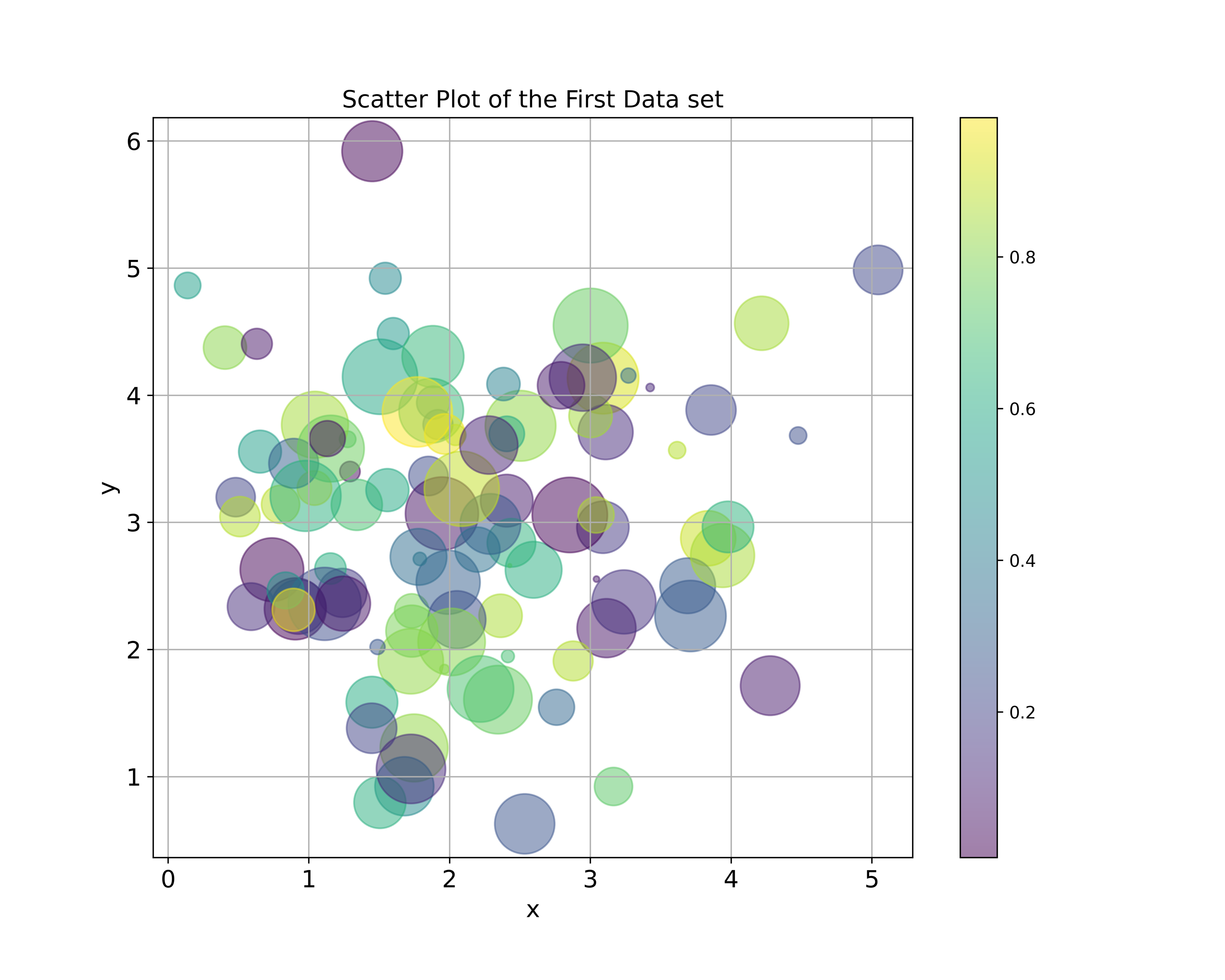
The Python script given below creates a scatter plot in which the marker dimensions are scaled and the colors of every marker are different.
# let us generate a more fancier scatter plot
# let us define colors
colorArray=np.random.rand(len(x1))
sizeArray=2000*np.random.rand(len(x1))

plt.figure(figsize=(10,8))
# s is the size
# c is the color
# cmap is the color map
plt.scatter(x1,y1, marker='o',
            s=sizeArray, c=colorArray,
            cmap='viridis', alpha =0.5)

plt.title('Scatter Plot of the First Data set', fontsize=14)
plt.xlabel('x', fontsize=14)
plt.ylabel('y',fontsize=14)
plt.colorbar()
plt.tick_params(axis='both',which='major',labelsize=14)
plt.grid()
plt.savefig('ScatterPlot2.png', dpi=600)
plt.show()
We create two arrays: colorArray and sizeArray. Every entry of the array called colorArray specifies the color of every marker, and every entry of the array called sizeArray specifies the size of the marker. The addition parameter of the scatter function that are not used in the previous script are
- s=sizeArray – we specify the size of markers. The size of the marker of every data point is defined by the corresponding entry of sizeArray.
- c=colorArray – we specify the color of markers. The color of the marker of every data point is defined by the corresponding entry of colorArray.
- cmap=’viridis’ – is the used color map for markers.
The generated scatter plot is shown in the figure below.