 by
by This is our first post in a series of posts on time series analysis in Python. In this post, we explain how to generate random and autoregressive time series and how to perform basic time-series diagnostics. We use the statsmodels Python library. The GitHub page with the codes used in this and in previous tutorials can be found here. The YouTube video accompanying this post is given below.
White-noise sequence
The following code is used to set-up the Python libraries for this post.
# -*- coding: utf-8 -*-
"""
Intro to time series analysis in Python
Created on Fri Jan  1 21:05:29 2021

@author: Aleksandar Haber

"""
# standard imports
import pandas as pd
import numpy as np
import matplotlib.pyplot as plt
import matplotlib as mpl

# statsmodels libraries
import statsmodels.api as sm

# set for reproducibility
np.random.seed(1)
We use the code line 19 to say to set the seed for the random number generator. Namely, this code line is used to make sure that every code execution generates the same sequence of random numbers. In this way we can ensure that our code is reproducible.
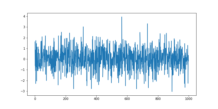
The following code lines are used to generate a white noise time sequence.
###########################################################################################
#                                WHITE NOISE
###########################################################################################
# number of time samlpes
time_samples=5000

time_series=np.random.normal(size=time_samples)

# plot the generated time series
plt.figure(figsize=(10,5))
plt.plot(time_series[0:1000])

time_series_pd = pd.Series(time_series)
The code is self-explanatory except the code line 13. This code line is used to convert the Numpy vector to the Pandas time series data structure. This is not a completely necessary step, however, in our future posts, we will often use this conversion so it is good to get accustomed to this conversion. The generated white noise sequence is shown in the figure below.
The first time-series diagnostic that we are going to perform is the autocorrelation test. We expect that the generated time-series is uncorrelated. The following code lines are used to compute (better to say “estimate”) and to plot the autocorrelation function of the generated time series.
# autocorrelation plot
# https://www.statsmodels.org/stable/generated/statsmodels.graphics.tsaplots.plot_acf.html
# https://www.statsmodels.org/devel/generated/statsmodels.tsa.stattools.acf.html
# https://stackoverflow.com/questions/28517276/changing-fig-size-with-statsmodel

with mpl.rc_context():
    mpl.rc("figure",figsize=(12,8))  # here adjust the figure size
    sm.graphics.tsa.plot_acf(time_series_pd, lags=40)
    plt.savefig('acf_random.png')
We use a matplotlib context manager to temporarily set the plotting properties. Code line 8 is used to compute and to plot the autocorrelation function. The generated plot is shown in the figure below.
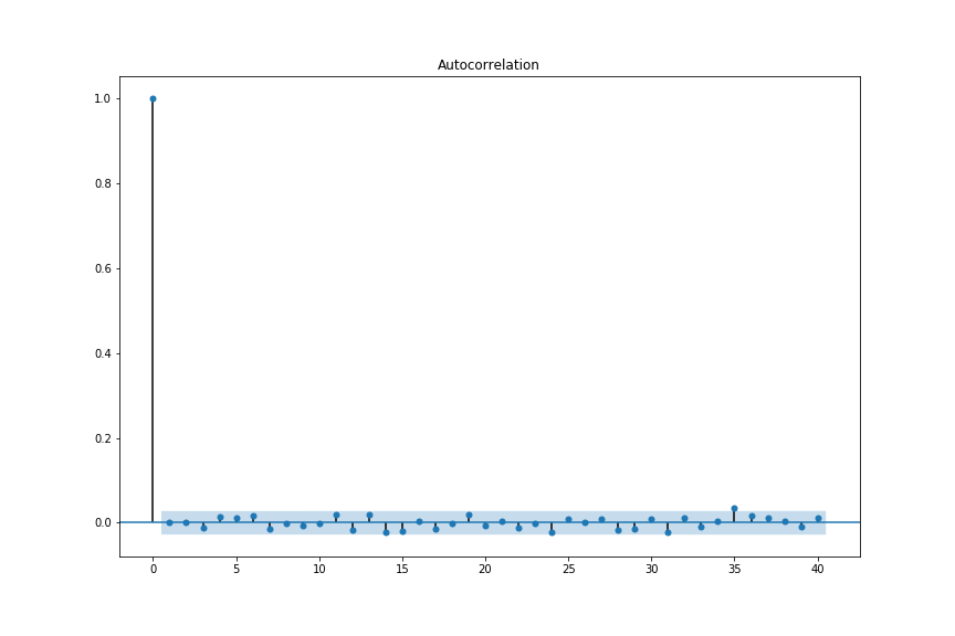
The blue shaded region corresponds to the confidence intervals used to test the hypothesis that the time-series samples are independent and identically distributed random variables. If this is true then approximately 95% of estimated values of the correlation function (for different lags) should fall within the shaded region. This is true in our case, so the autocorrelation plot confirms that the time series samples are independent and thus uncorrelated. This confirms that the generated time sequence has the properties of a white noise sequence. Autocorrelation plots are also used to check for the time-series stationarity and to investigate additional statistical properties of time series that will be explained in our future posts.
The statsmodels library contains the functions for extracting the values and confidence intervals of the autocorrelation function. The following code lines are used to perform these tasks.
# store the numerical values in vectors
# alpha - confidence interval
# see also
# https://stackoverflow.com/questions/61855401/statsmodels-pacf-plot-confidence-interval-does-not-match-pacf-function
acf_random, acf_random_confidence = sm.tsa.stattools.acf(time_series_pd,nlags=40, alpha=0.05)
The partial autocorrelation function is also very useful for investigating the properties of time series. The following code lines are used to compute and to plot the partial autocorrelation function.
# partial autocorrelation plot
# https://www.statsmodels.org/stable/generated/statsmodels.graphics.tsaplots.plot_pacf.html
# https://www.statsmodels.org/stable/generated/statsmodels.tsa.stattools.pacf.html

with mpl.rc_context():
    mpl.rc("figure",figsize=(12,8))  # here adjust the figure size
    sm.graphics.tsa.plot_pacf(time_series_pd, lags=40)
    plt.savefig('pacf_random.png')

# store the numerical values in vectors
# alpha - confidence interval
pacf_random, pacf_random_confidence = sm.tsa.stattools.pacf(time_series_pd,nlags=40, alpha=0.05)
Here is the plot of the generated partial autocorrelation function.

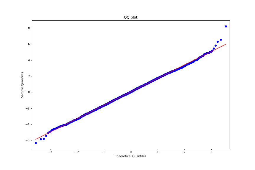
Partial autocorrelation plots are often used to estimate the order of the autoregressive processes. This will be explained in the sequel. Before we explain this, we first explain how to generate the QQ-plots. The following code lines are used to generate the QQ-plots.
# QQ plot
# https://www.statsmodels.org/stable/generated/statsmodels.graphics.gofplots.qqplot.html


with mpl.rc_context():
    mpl.rc("figure",figsize=(12,8))  # here adjust the figure size
    sm.qqplot(time_series_pd,line='s')
    plt.title('QQ plot')
    plt.savefig('QQ_random.png')
The generated QQ-plots are shown in the figure below.

The default theoretical distribution in the statsmodels QQ-plot function is the standard normal distribution. Consequently, since the dots on the graphs are very close to the ideal 45% line (ideal normal distribution), we can observe that the samples of the generated time sequences are most likely sampled from a normal distribution.
AutoRegressive (AR) sequence
Arguably, the most simple time-series sequence that exhibits a certain degree of autocorrelation between the time samples is the AutoRegressive (AR) time sequence. The AR sequences are mathematically defined as follows
(1) 
where  is a sample of the AR time sequence,
  are the coefficients of the AR sequence, and
  is a sample of a white noise sequence. The parameter
  is the past window or the order of the AR time series. Usually, in the literature, the AR processes are denoted by AR(p), where the number in the parentheses is used to denote the model order p.
In the sequel, we explain how to generate and to test the AR(1) process. The following code lines are used to generate the AR(1) process.
# number of time sampes
time_samples=5000

# coefficient
ar_coeff=0.8

time_series_ar=np.random.normal(size=time_samples)

for i in range(time_samples-1):
    time_series_ar[i+1]=ar_coeff*time_series_ar[i]+np.random.normal()

# plot the generated time series
plt.figure(figsize=(10,5))
plt.plot(time_series_ar[0:1000])
plt.savefig('ar_process.png')
time_series_ar_pd = pd.Series(time_series_ar)
The generated plot is shown in figure below.

The following code lines are used to estimate the autocorrelation function of the AR(1) series.
# autocorrelation plot
# https://www.statsmodels.org/stable/generated/statsmodels.graphics.tsaplots.plot_acf.html
# https://www.statsmodels.org/devel/generated/statsmodels.tsa.stattools.acf.html

with mpl.rc_context():
    mpl.rc("figure",figsize=(12,8))  # here adjust the figure size
    sm.graphics.tsa.plot_acf(time_series_ar_pd, lags=40)
    plt.savefig('acf_ar.png')

# store the numerical values in vectors
# alpha - confidence interval
acf_ar, acf_ar_confidence = sm.tsa.stattools.acf(time_series_ar_pd,nlags=40, alpha=0.05)
The generated plot is shown in figure below.

From Fig. 6, we can observe that the estimated autocorrelation function does not correspond to a white noise sequence and that there is a correlation between the samples of the generated time series.
The following code lines are used to generate a partial autocorrelation function of the time series.
# partial autocorrelation plot
# https://www.statsmodels.org/stable/generated/statsmodels.graphics.tsaplots.plot_pacf.html
# https://www.statsmodels.org/stable/generated/statsmodels.tsa.stattools.pacf.html

with mpl.rc_context():
    mpl.rc("figure",figsize=(12,8))  # here adjust the figure size
    sm.graphics.tsa.plot_pacf(time_series_ar_pd, lags=40)
    plt.savefig('pacf_ar.png')

# store the numerical values in vectors
# alpha - confidence interval
pacf_ar, pacf_ar_confidence = sm.tsa.stattools.pacf(time_ar_pd,nlags=40, alpha=0.05)
The generated partial autocorrelation function is given in the figure below.

What can we observe from Fig. 7? We can see that the estimated partial autocorrelation function has a non-zero entry for the lag of 1. It can be shown that the largest non-zero lag for which the partial autocorrelation is non-zero is actually a good estimate of the model order of the AR process. Consequently, the partial autocorrelation plot can be used as a tool for estimating the model order of the AR processes.
Finally, the following code lines are used to compute the QQ-plot of the generated AR process.
# QQ plot
# https://www.statsmodels.org/stable/generated/statsmodels.graphics.gofplots.qqplot.html

with mpl.rc_context():
    mpl.rc("figure",figsize=(12,8))  # here adjust the figure size
    sm.qqplot(time_series_ar_pd,line='s')
    plt.title('QQ plot')
    plt.savefig('QQ_ar.png')
The generated plot is shown in the figure below.
What can we observe from Fig. 8? We can observe that the empirical distribution generated by the samples of the AR(1) process deviates from the ideal normal distribution at the end of the intervals. Although this deviation is not so severe, it can indicate a non-normality of the samples.